New Hegyvidék Gallery, Budapest, HU
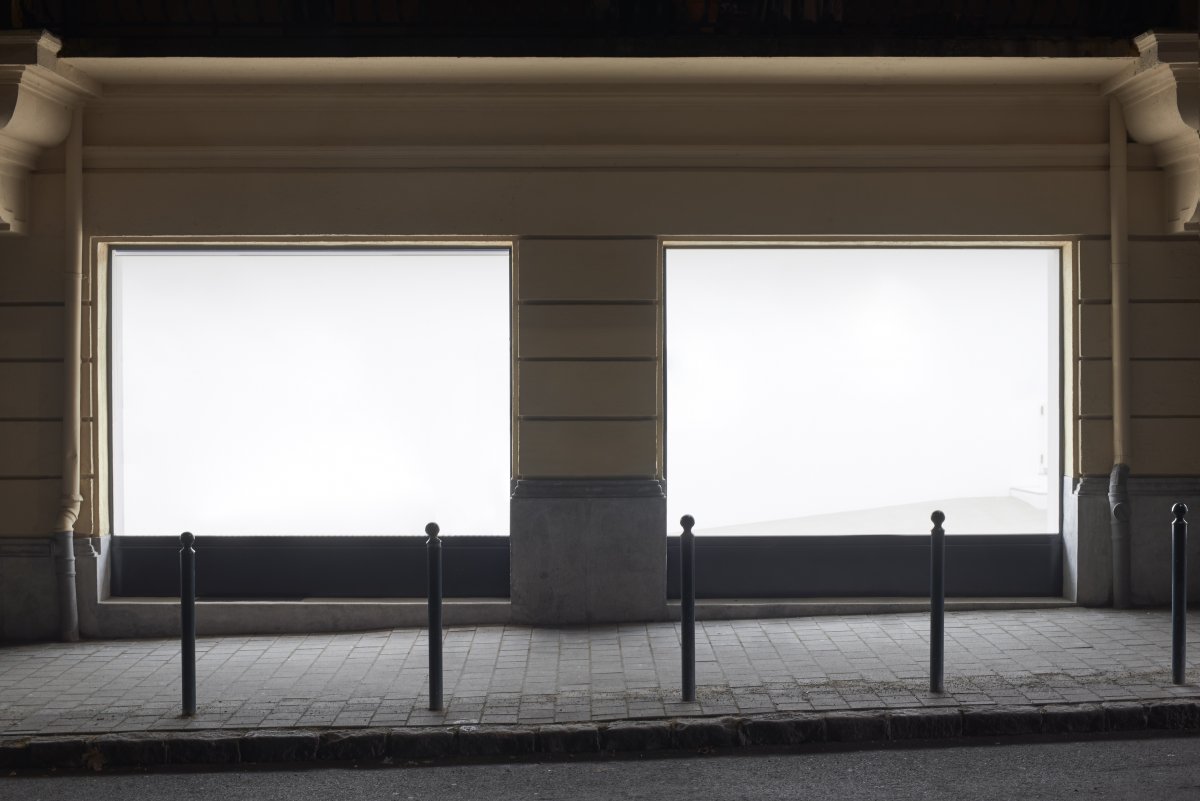
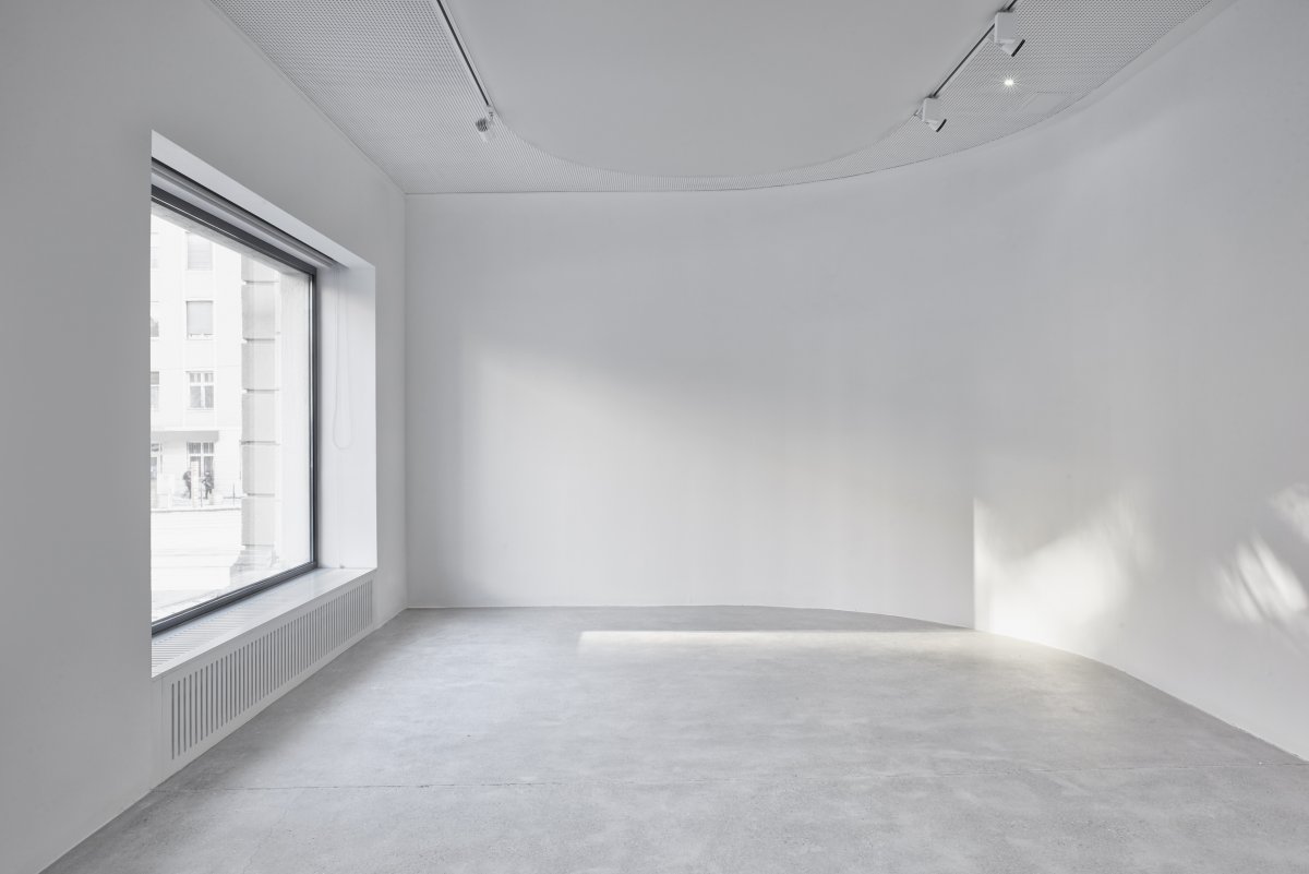
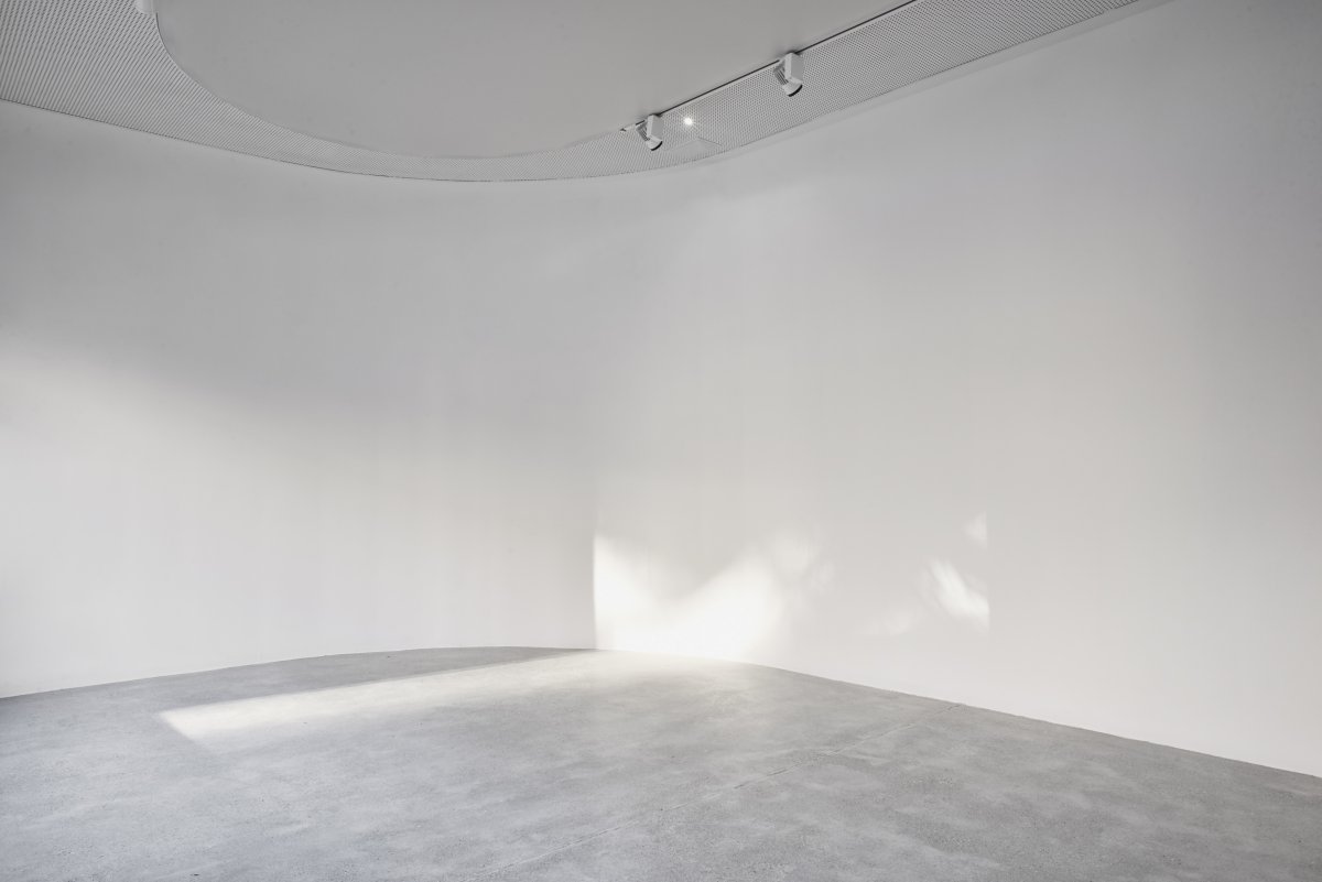
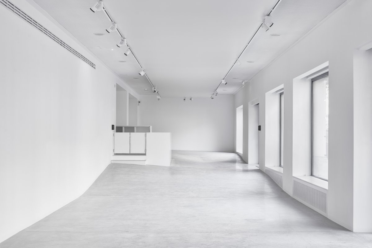
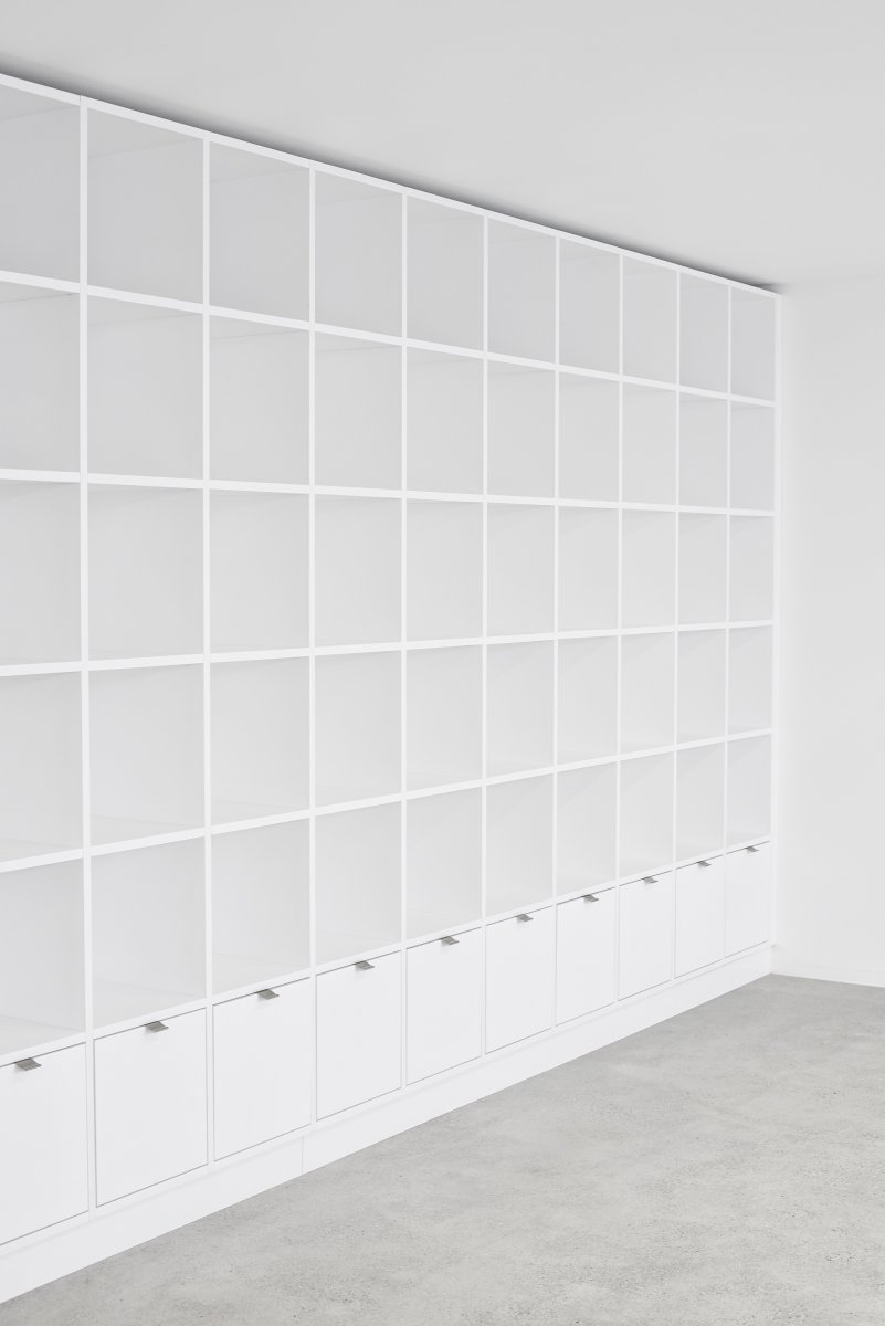
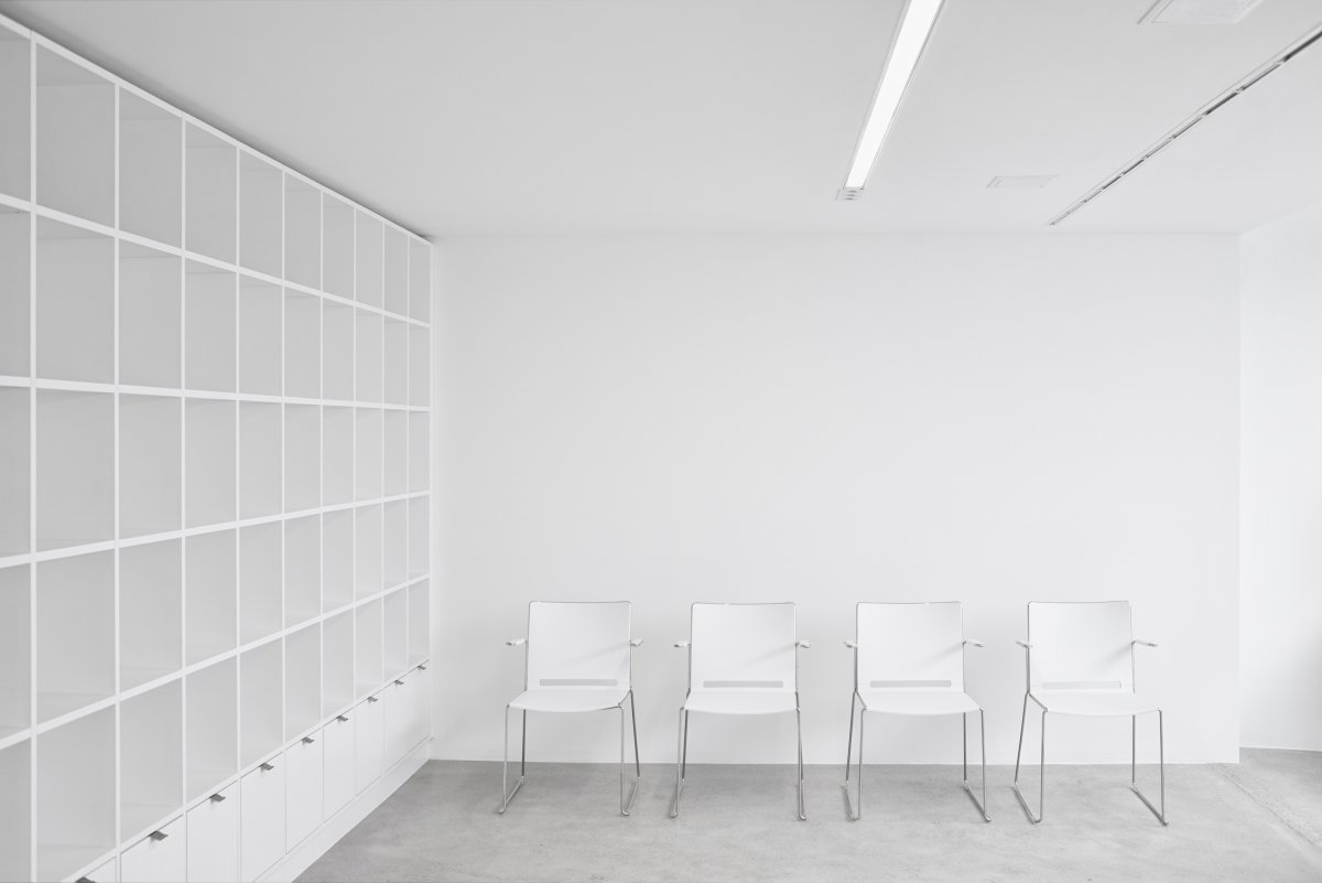
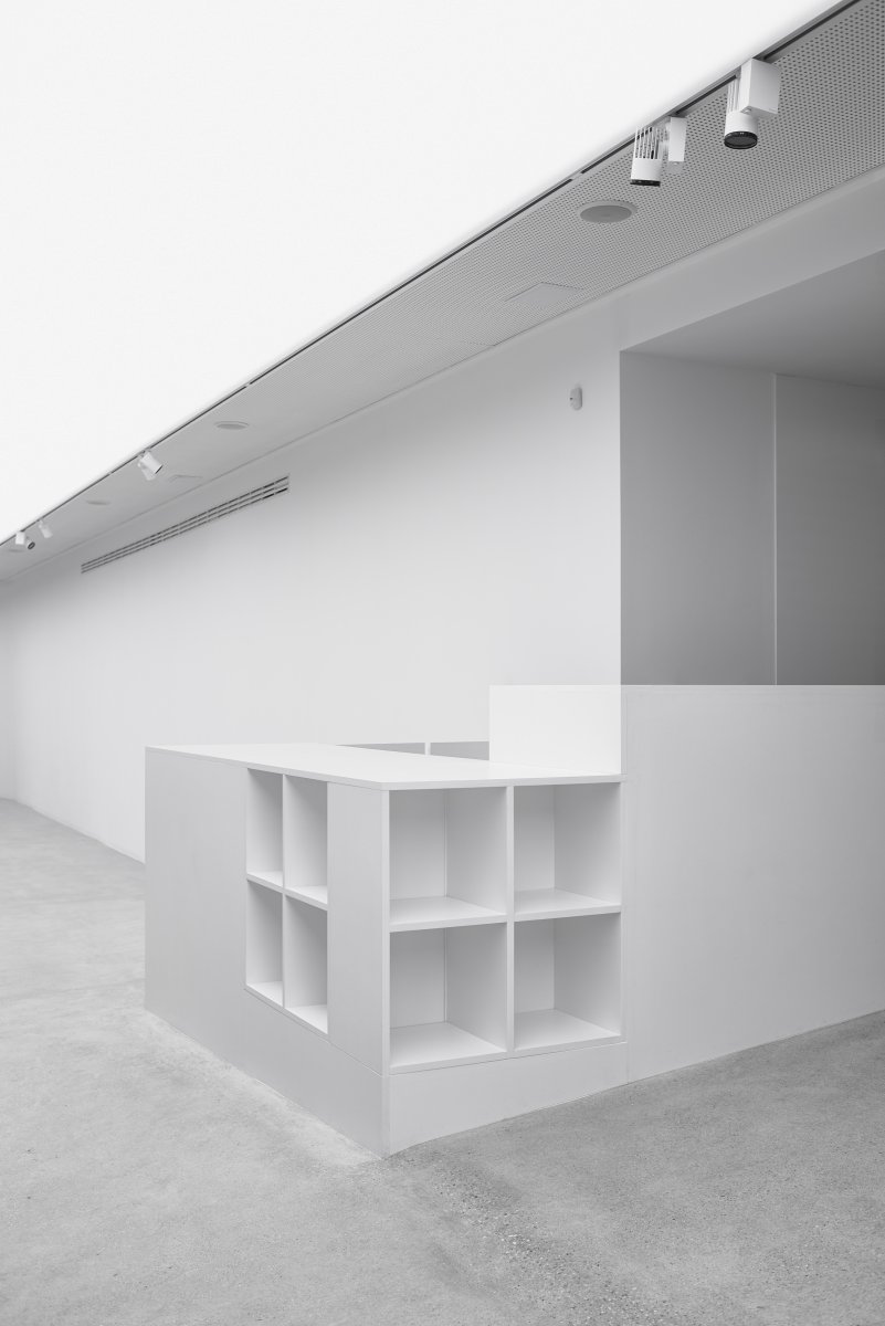
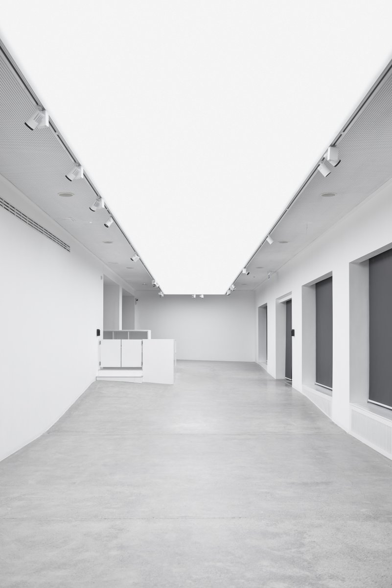
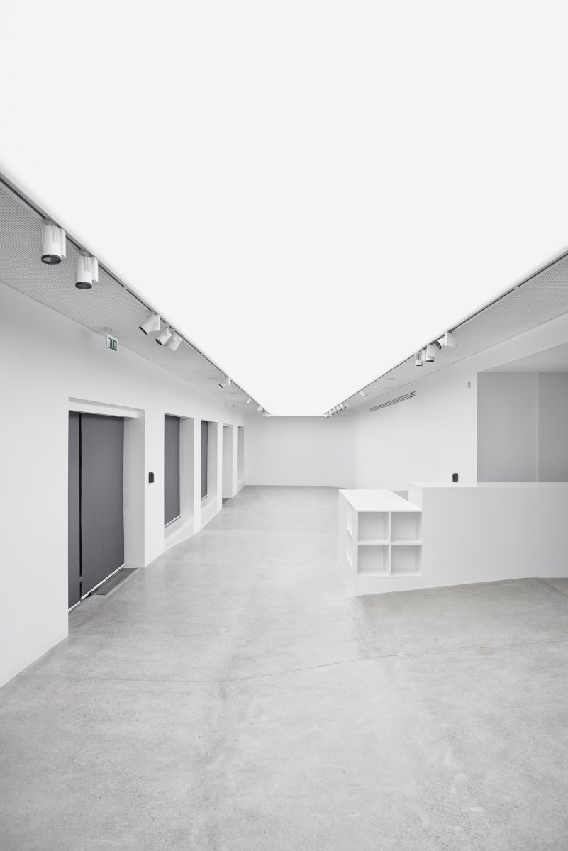
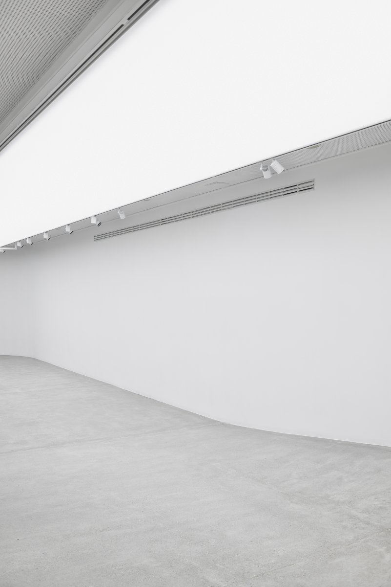
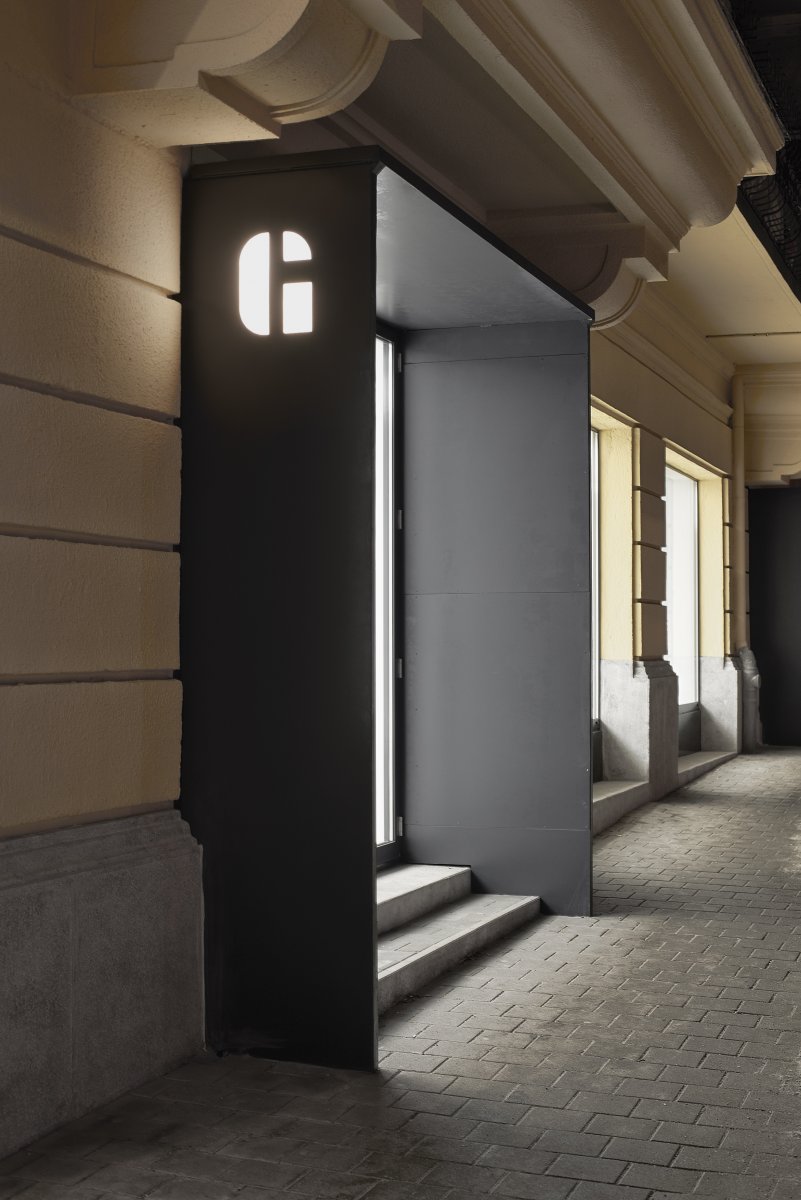
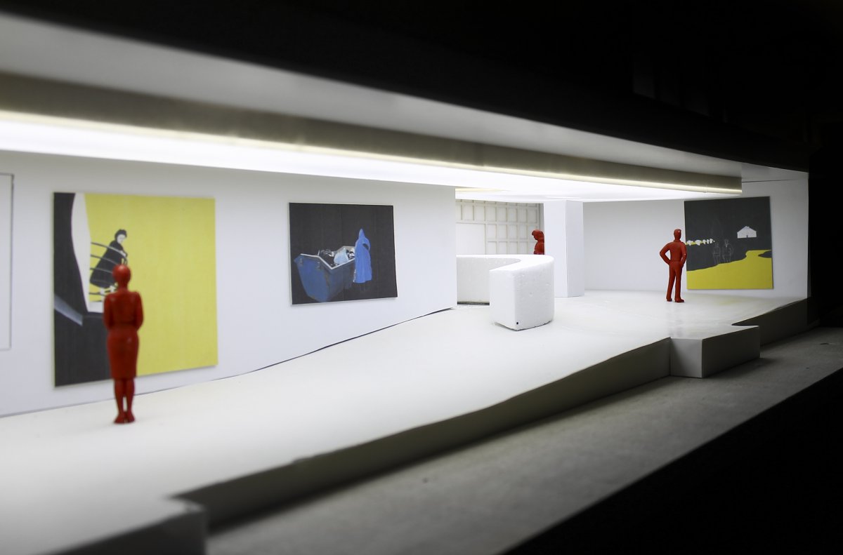
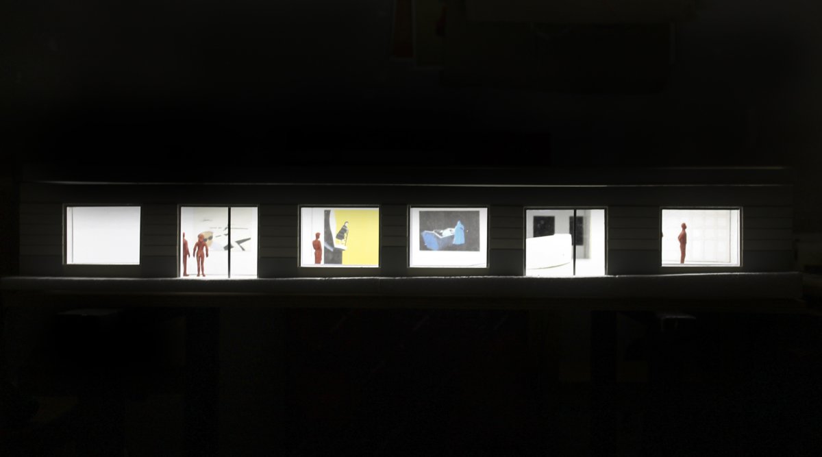
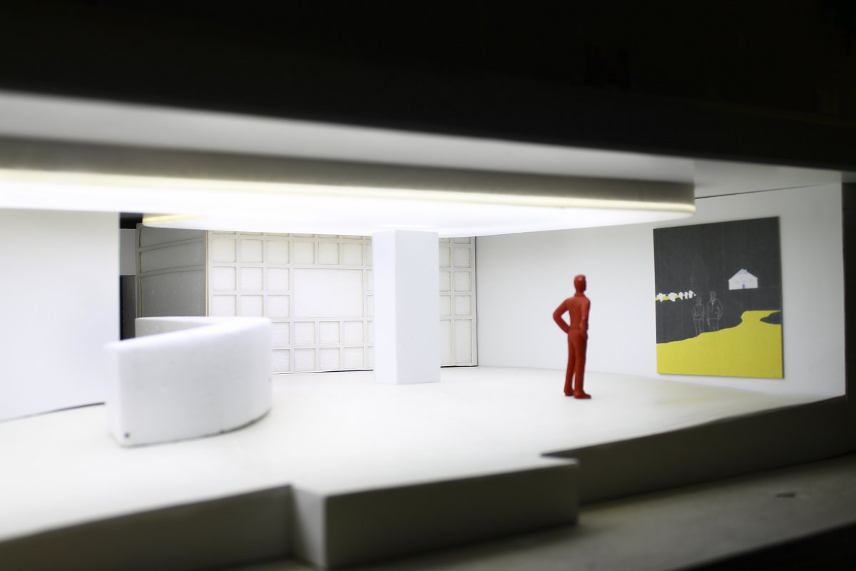
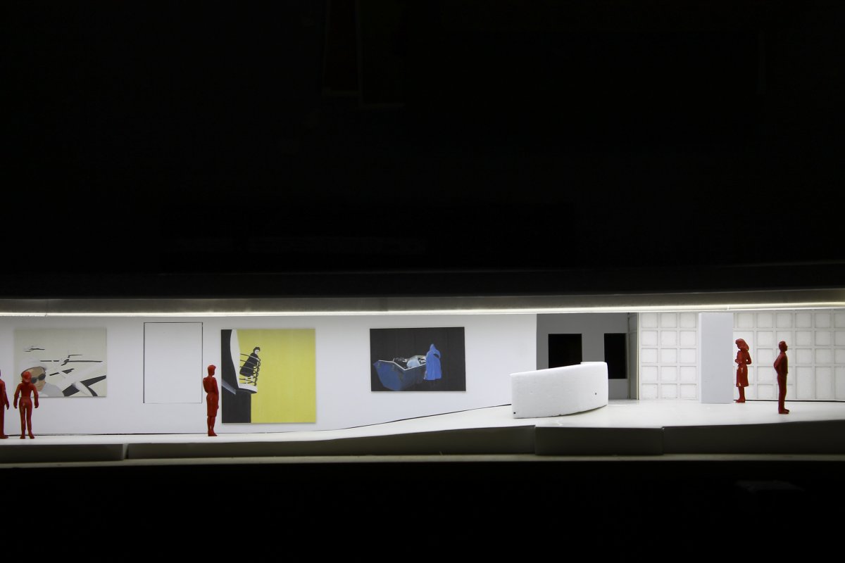
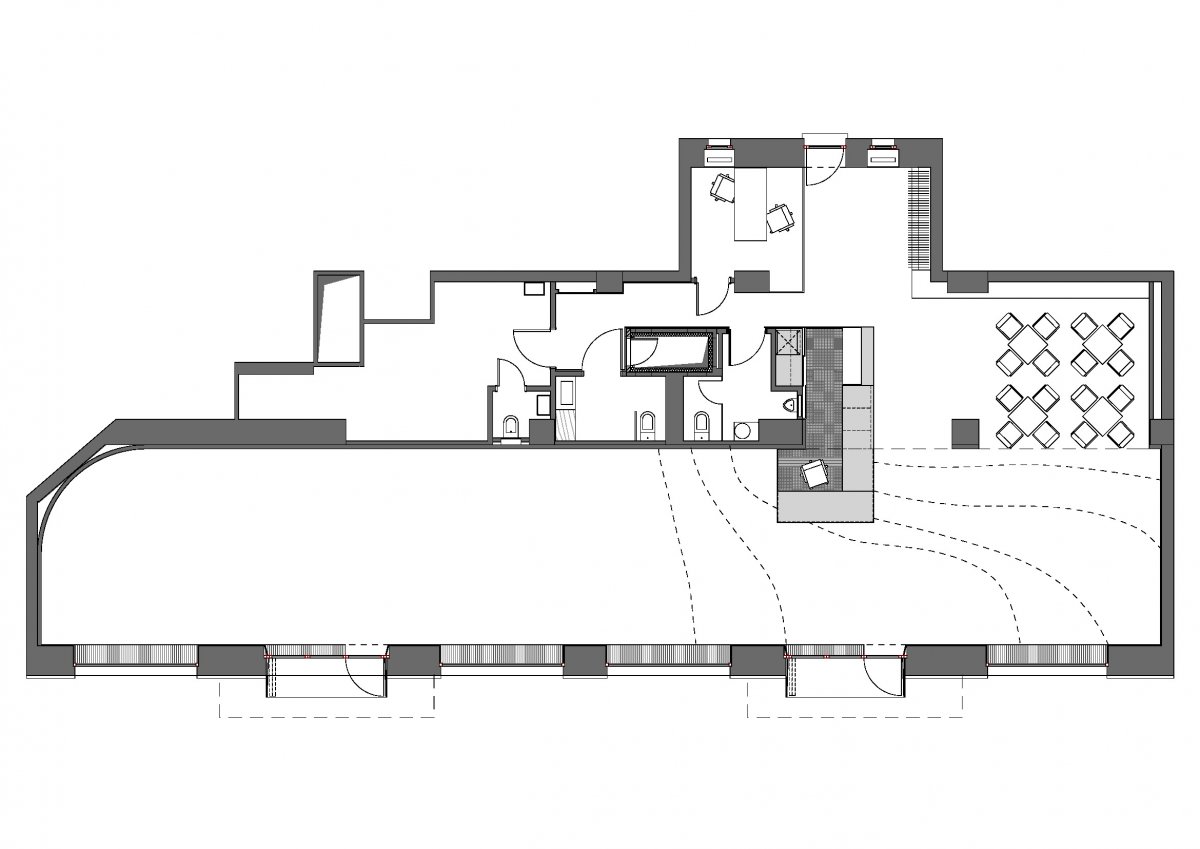
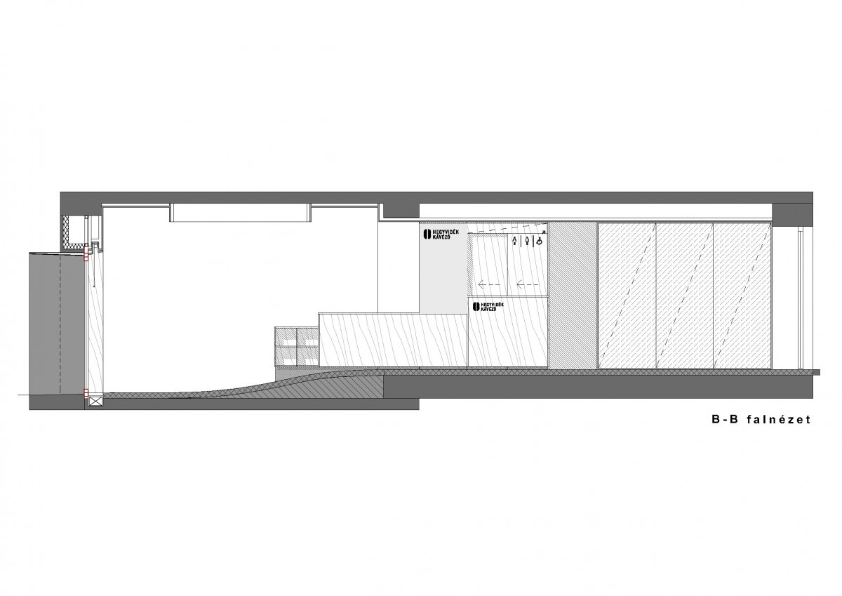
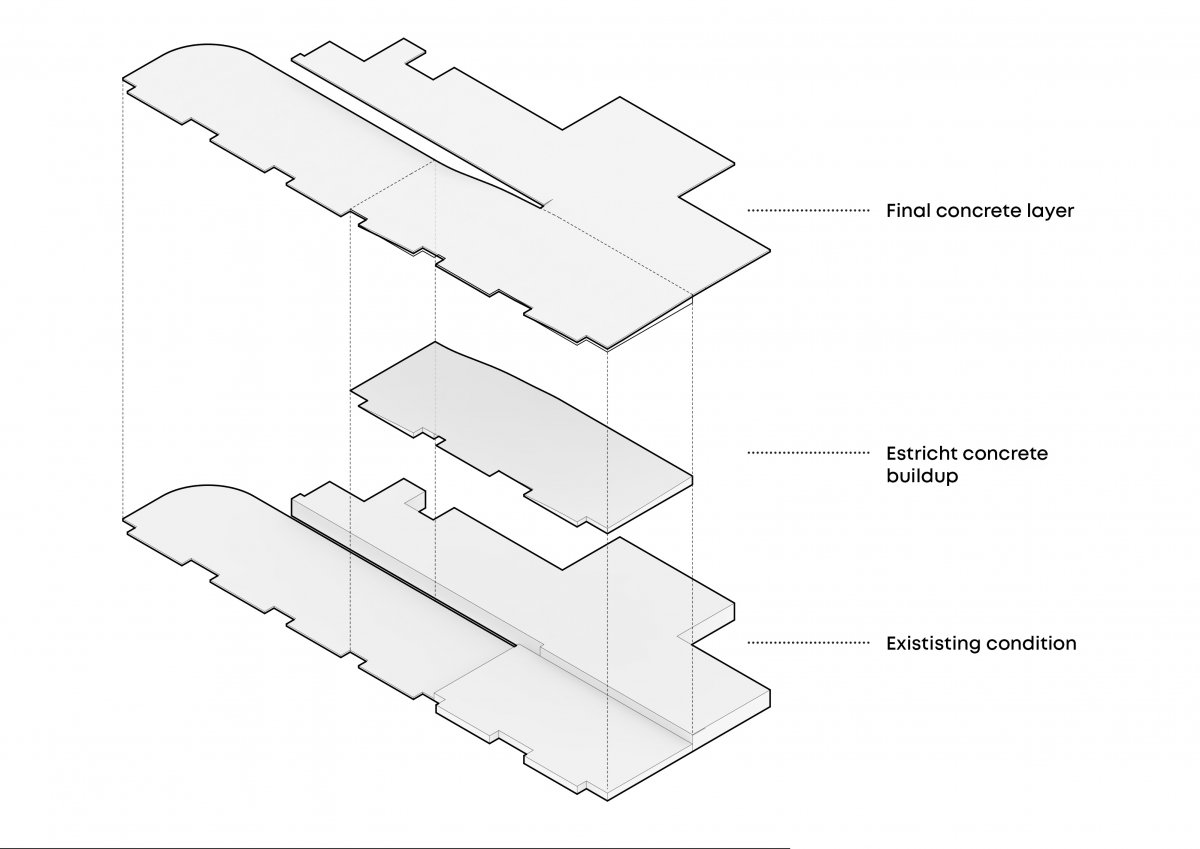
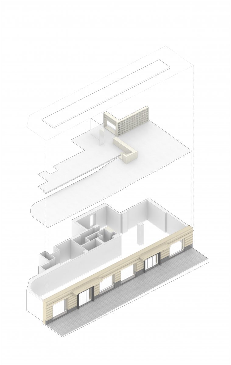
The white cube’s encounter with the slope. Planning the white cube exhibition space with respect of the terrain conditions. A responsive white cube. This is the easiest way to describe the Hegyvidék Gallery opened on the slopes of the Buda Hills. The exhibition space provides a neutral medium to the reception of artworks, however, it is not only a simple exhibition space. It both shapes the place of connoisseurship and the relation to it: on the longer side the space follows a downhill and therefore tracks the features of the relief. The level difference usually solved with steps, here in Hegyvidék Gallery it is continuouslymerging into a slightly sloping terrain. This makes the white cube a unique space that is softened by terrain conditions. What is outside is also inside: the simple white walls cut space out and at the same time they are in sync with their immediate environment. This is also true the other way around: passersby and those waiting in traffic can observe the artworks placed inside the gallery. The huge windows act like the walls of an aquarium, allowing for the examination of the apparently floating artwork in the glaring white, hardly definable space from the outside. The interior design elements substitute as furniture, the windowsills hiding the heaters can be used as seats to take a break and look around from a relaxed spot. The contiguous concrete floor evokes the softness of cyclorama used in studio photography and the Barrisol ceiling lights also enhance this soft effect. The community space opens from the highest point of the gallery. It can serve as a separate space for screenings or museum education courses and at the same time reflects the vision of the Client to provide a meeting point, a cultural center for the district.
